If you have done any research into website design and development, you might have heard the phrases ‘information architecture’ and ‘ease of navigation.’ These terms are mentioned regularly in the industry, but what do they mean, and why are they important? In this post, we look at information architecture and eCommerce navigation and how our recent project for Kenro perfectly highlights their importance.
What is information architecture?
Information architecture centres around helping users to understand their time on a website. It does this by focusing on where they are, what is on the website and what they can expect from their online experience. This is done by organising, structuring and clearly labelling content to ensure that a user's time on the website is beneficial. Information architecture aims to help someone find the information they seek and easily complete tasks. In website design, information architecture involves designers and developers creating pages that allow users to find the information they need easily and with minimal effort.
What is ease of navigation?
The term ‘ease of navigation’ refers to how simple it is for a user to navigate a website. It looks at how easy it is to find what they are looking for and if any challenges are faced moving from one page to another. It’s important for website visitors to find the content they are looking for, and ease of navigation makes this an enjoyable and straightforward task. Everything from the layout of the website’s pages and menus to how well the website is labelled is factored into determining the ease of navigation.
Case study: Kenro
About the brand.
Kenro is a ‘one-stop shop’ for photographic accessories, selling everything from tripods, flash guns and lighting to film, slide and photo scanners. The brand also offers photography-related homeware, such as decorative frames, photo memory albums and homeware from its sister brand Kusso. Supplying both consumers and trade, Kenro is known for consistently delivering knowledgeable advice, reliable service, and great value.
The background.
Kenro needed a fresh new Shopify Plus website that also delivered an improved user experience. While Kenro had a huge range of products and categories, the brand knew the navigation wasn’t working well for its customers.
The existing navigation structure had all product categories listed under a single dropdown; from there, other categories were accessible. As a result, users needed to guess which category their desired product would fall into. If they guessed wrongly, they’d potentially be scouring multiple categories to find what they were looking for.

During the project's research phase, this was confirmed by user surveys we conducted. We discovered that existing customers found the website navigation relatively easy if they knew which product category the item was in from a previous shopping experience. However, it was hard for a new user to find specific products within the current categorisation.
We also found that the website was difficult to use on mobile devices due to the high number of bugs users would encounter. Selecting a category was also difficult, meaning clicking on the wrong category was highly likely.

The challenge.
In migrating to Shopify Plus, Kenro’s goal was to open up more direct-to-consumer opportunities. Hence, the design challenge immediately became providing clear information architecture and navigation for these consumers as well as B2B customers.
The importance of this was reinforced by Kenro’s decision to migrate their homeware brand Kusso into the main website, as it would significantly expand the breadth of product types and ranges.
The solutions.
1. Main navigation.
One of the first things we did to Kenro’s website was to restructure the navigation, breaking the main product categories into Shop Photo, Shop Video and Shop Home. This immediately separates the various target markets and helps users narrow their search in small steps. Using ‘Photo’, ‘Video’ and ‘Home’ as keywords make it much easier for new users to understand the different product ranges Kenro houses. It shows them which navigation path to follow, depending on the specific product they seek.
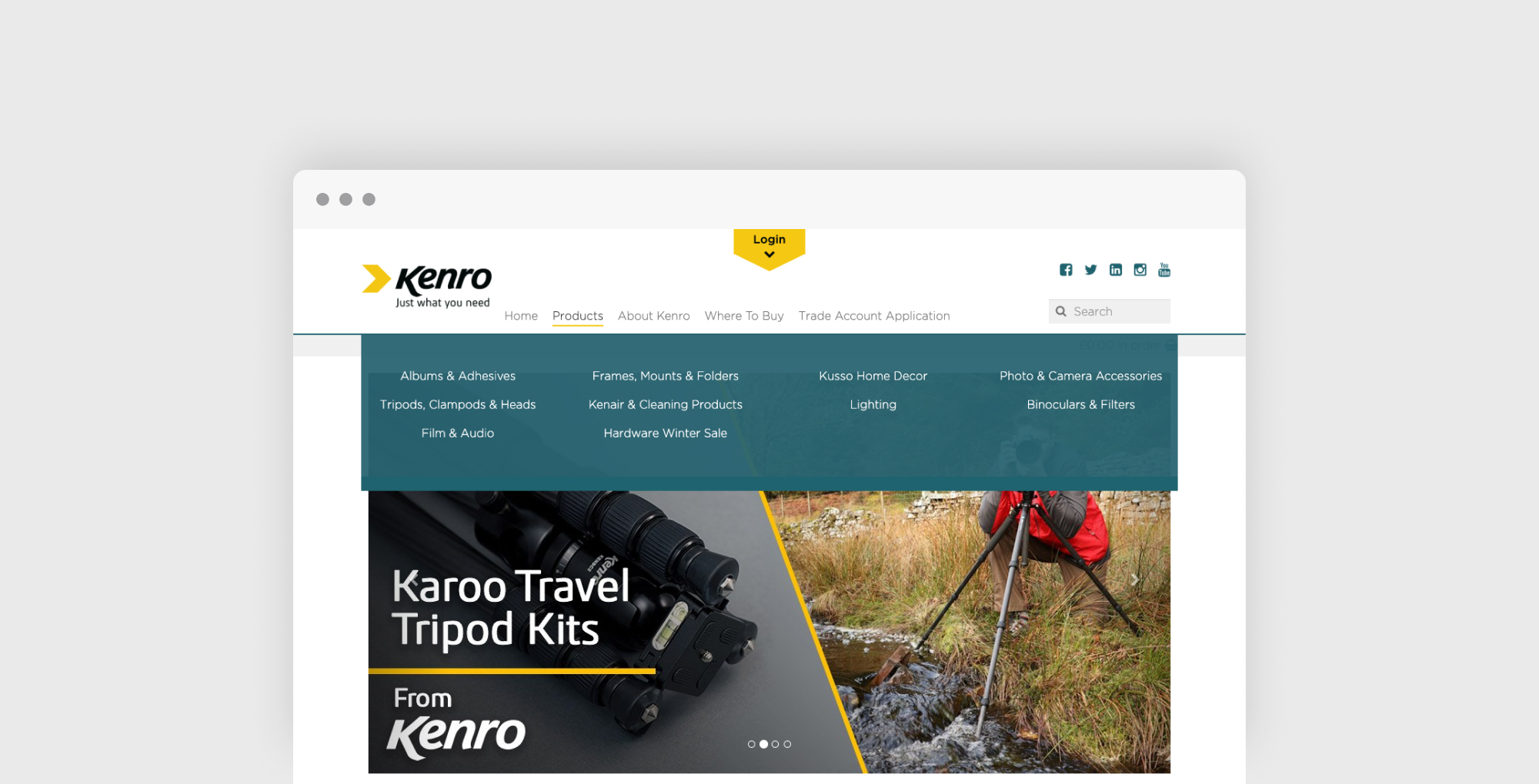
In the desktop mega menu, we added a two-tier approach for users. This allows website visitors to narrow their search by narrowing the scope and providing more specific results. When hovering over individual categories, subcategories appear, which users can select based on what they are looking for.

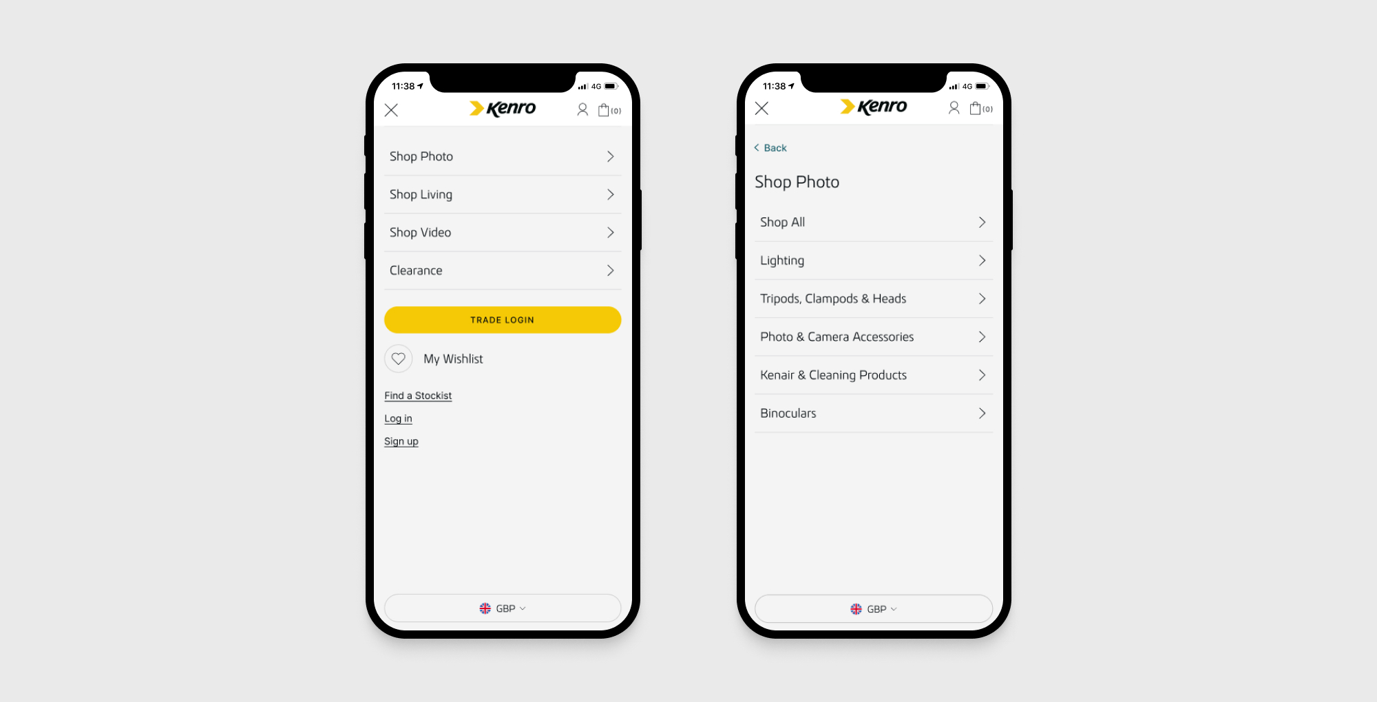
We approached the mobile website in the same way, allowing users to select a category and then see a variety of subcategories. We also made the mobile website much easier to use overall, and we did this in several ways. For example, we focused on creating a full-screen takeover, ensuring that tap target standards were met. We also ensured subcategories have a back button to make it easy for users to change their scope if needed. The subcategory titles are also displayed so users know where they are in their current navigation path. We also improved the ease of navigation by adding ‘shop all’ CTAs in main categories and subcategories to make it as simple as possible for users to browse through product ranges.

2. Category page.
As Kenro has a wide range of products, an intermediary category page was the best approach. Users can access this by selecting one of the main navigation links, such as Shop Photo, and then be taken to a category page that shows the top six products from each subcategory within that larger category. This includes the top products from subcategories, such as Tripods and Accessories. This helps to boost the website’s click-through rate by encouraging users to look at the most popular products. For many users, this removes a navigational step from their shopping journey, as many products are shown immediately without being searched.
3. Quick links.
A small but mighty change was adding a quick link banner to the key pages to help users narrow their search quickly and easily. This includes the Home, Category and Collection pages. These links then take users to the relevant collection pages, further improving the ease of navigation.
In focus: conclusion.
As you can see, we faced many challenges regarding improving the information architecture and ease of navigation for Kenro, but our designers found impressive solutions! Equipped with a fresh design and the power of Shopify Plus, Kenro’s new site has them prepared to capture new audiences, whether direct-to-consumer or B2B.
Fancy a chat about your eCommerce store?
We're a personal and proactive Shopify Plus agency that designs, builds and optimises beautiful bespoke eCommerce solutions to help your brand grow faster. Explore our expert Shopify services and browse our client work for Shopify inspiration. Alternatively, get in touch to discuss your requirements. We would love to help!


)


