
 "Easy & Effective Shopify Optimisation: Part 4 Delivery & Returns")
Today we conclude our Easy & Effective Shopify Optimisation Series with Jamie Willmott and Danny Guevara, blubolt’s resident optimisation gurus. Over four installments, we’re sharing advice to help you optimise your eCommerce site. Specifically, we’ll cover optimising pop-ups, product discovery, product copy, and delivery and returns.
In parts 1, 2 and 3, we discussed easy Shopify optimisation for pop-ups, product discovery, and product copy on your site. Part 4 below covers Shopify optimisation for delivery and returns.

Sealing the deal with well-optimised delivery & returns information.
If you’ve been following the series, by this stage you’ll have already optimised your website’s pop-ups, product discovery and product copy. But, in order to clinch the sale, you need to ensure your offering for deliveries and returns is easy to find and understand so customers can purchase with confidence.
So our overall message is that clarity trumps persuasion! Even if you have a great product with beautiful imagery at an unbeatable price, you could still lose the sale without clear delivery and returns information. For example, customers may be reluctant to purchase Christmas gifts from you if they can’t see whether they can be returned in the New Year.
But where should you start? In this post, we’ll show you the key updates to make across your website. Let’s get started!
1. Clearly display your delivery and returns policy across your site.
Through our user research, we’ve regularly seen that delivery concerns are one of the biggest anxiety points users have before purchasing. This is also a common theme whenever we run onsite surveys for ecommerce stores. In addition, users don’t like text-heavy, poorly formatted delivery and returns policy pages. Furthermore, users don’t want to contact customer support and wait around for an answer to their query. And lastly, customers aren’t impressed when they’ve gone through most of the checkout process only to discover they don’t meet the free threshold for deliveries!
Customers simply want to know: when will the item be delivered? How will it be delivered? And how much does it cost for delivery?
A quick audit and update of key pages on your site can avoid customer angst and provide a hassle-free delivery and returns experience. So let’s look at the key pages to update…
a. Product and cart pages with key delivery details.
The aim is to keep the user on the product page or cart page so state your proposition clearly. Be sure to offer pricing for different methods and minimum spends for free delivery.
Example: Pipers Farm
Blubolt client Pipers Farm is an award-winning online butcher selling grass-fed and free-range meat. Since the brand sells perishable products, crystal clear delivery details are essential to avoid them spoiling.
As such, the brand:
succinctly explains delivery options, prices and how the item is delivered (e.g. frozen) on the product page,
offers a delivery date selector on the product page so the customer knows the delivery information is tailored to their chosen product, and
provides a cart page message with “Spend XX more to get free mainland UK delivery” to encourage customers to increase their cart value to get free delivery.


b. Easy to read Delivery & Returns policy page.
Your Delivery & Returns page is a backup source of information for customers with specific queries, such as delivery costs to remote areas.
While this page is content-heavy by nature, good formatting can make it easier for customers to scan the information and quickly find what they need. So ensure your Delivery & Returns page is written in plain English and structured with headings, subheadings, and bullet points.
Example: Porcelain Superstore
blubolt client Porcelain Superstore is a family-run brand offering unique, stylish and high-quality porcelain tiles at unmatched prices. Check out the brand's user-friendly deliveries page below:
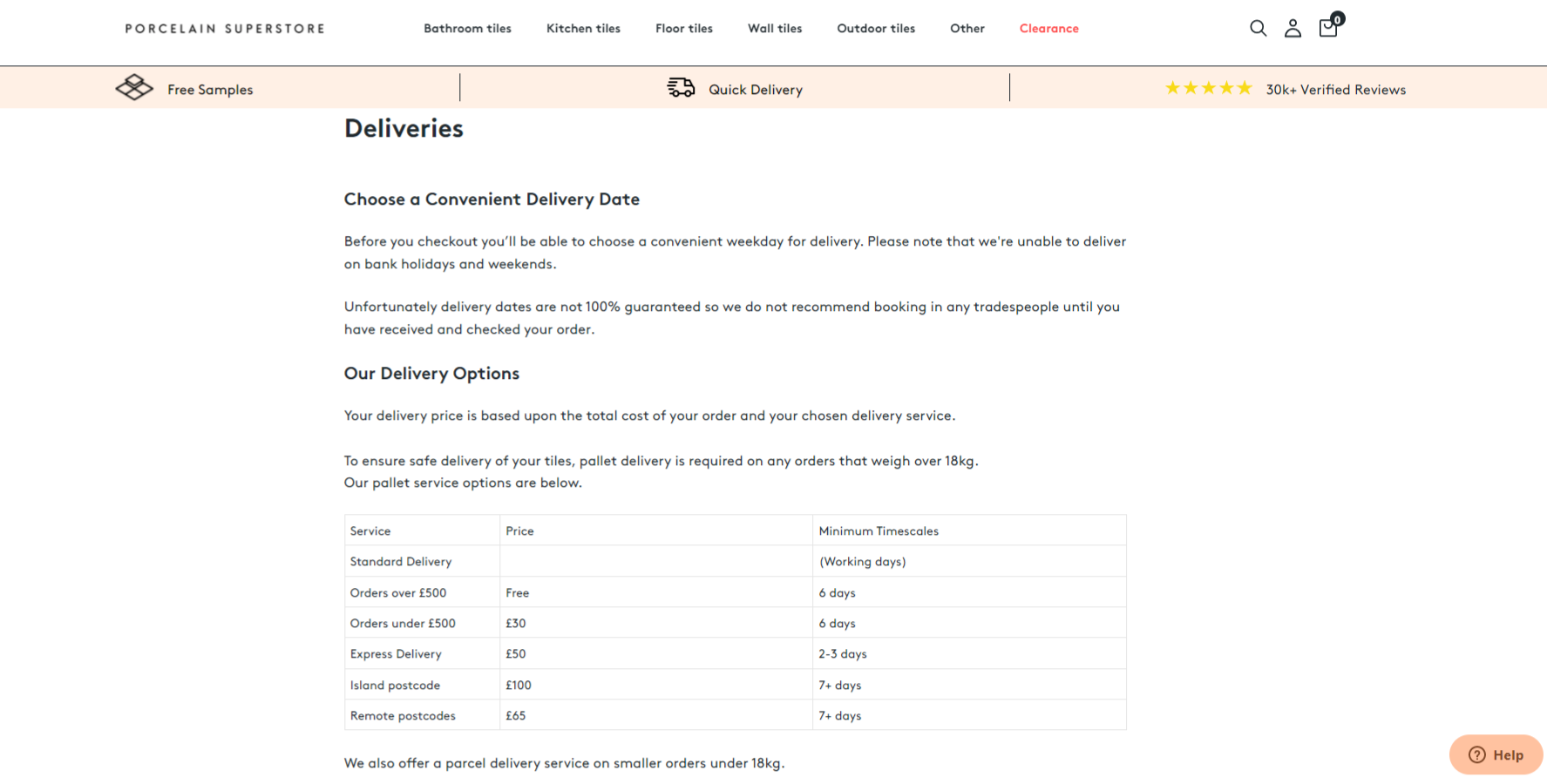
So what makes it a good delivery page? The brand uses:
subheadings to split the content into bite-size pieces,
tables to clearly format service, price and timescales,
bullet points for speedy reading,
paragraphs for points requiring further explanation, and
a “quote block” (in peach below) to emphasise important recommendations for customers.

c. Homepage messaging for free delivery offers.
If you’re offering free delivery, be sure to include this on your homepage and clearly state any minimum spend. Be sure to also link to your full delivery & returns page so customers can clearly access all information.
Example: Teapigs.
Blubolt client teapigs are known as purveyors of top teas, making great tea accessible and a bit more fun! As seen on the brand’s homepage below, they use:
a banner at the very top to highlight free delivery messaging that users can click through to the delivery & returns page for more details, and
further messaging on above the hero banner to emphasise their USPs e.g. plastic-free packaging, award-winning tea and community.

2. Be transparent about possible delivery delays.
While supply chain and delivery issues continue to be commonplace, you still need to be upfront with customers about potential delays. For example, if you’re waiting for new stock to arrive, advise customers:
the scheduled date for delivering the product, and
how you will keep them updated with any changes to that date.
In terms of keeping your customers happy in the long term, clarity wins every time. And your future self will avoid a deluge of ‘where’s my order?’ customer queries and complaints!
Example: Made.com
Online furniture retailer Made.com shows how to communicate possible delays effectively in the image below. For example, on a product page the brand uses:
a delays notification block (in yellow) above the Add to Basket button, and
within the same notification block, employs the phrase “there are 2 left for estimated dispatch in 10-12 weeks” to instil FOMO.

Delivering the goods: our top delivery & returns tips for Shopify optimisation.
So that wraps up our top delivery and returns tips with the key takeaway being that clarity trumps persuasion! By making our suggested updates across your website, your customers will be able to purchase with confidence.
While this is the final part of our Shopify optimisation series, you can still catch up on parts 1-3. Check out our easy Shopify optimisation tips for pop-ups, product discovery, and product copy.
Have your own Shopify Plus project?
We're a personal & proactive Shopify Plus agency that designs, builds & optimises beautiful eCommerce solutions to help your brand grow faster. Explore our expert Shopify services and browse our client work for Shopify inspiration. Alternatively, get in touch to discuss your requirements. We would love to help!


